COACH MARC LOGO DESIGN
In the world of sports and fitness, a logo isn’t just a mark — it’s a symbol of strength, movement, and motivation. It represents the drive to push limits, the discipline to stay consistent, and the passion that fuels performance. That’s why I use my S.H.A.P.E. Design Process, a framework built to ensure every design captures that energy while staying true to your brand’s identity:
S – Search: Deeply understanding the brand and gather inspiration to set creative direction.
H – Hand: Sketch ideas and convert them into vector designs.
A – Analyze: Analyze concepts for effectiveness and memorability.
P – Presentation: Present refined concepts with strategic reasoning.
E – Engage: Collaborate with the client to finalize and strengthen the design.
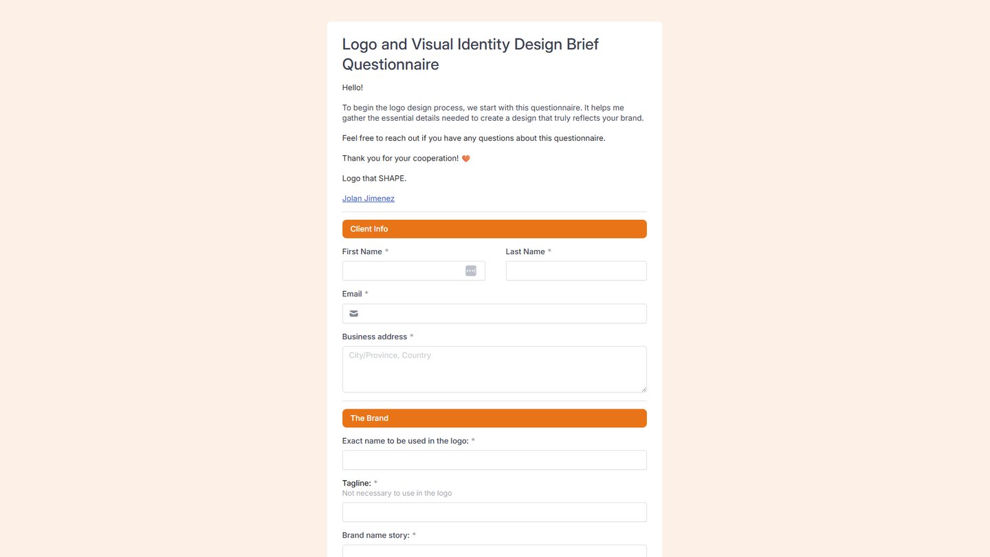
My S.H.A.P.E design process led me to create this logo and visual identity. It is impossible for me to begin designing without asking a lot of questions. That's why the Search Phase from the S.H.A.P.E design process is the first step in creating a customer-focused logo design.
A search for or discovery of the brand can assist me in identifying the problem. This will allow me to tailor my approach and strategies accordingly. Furthermore, it will give me a better understanding of what the brand stands for and how I can contribute to its success.

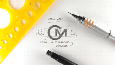
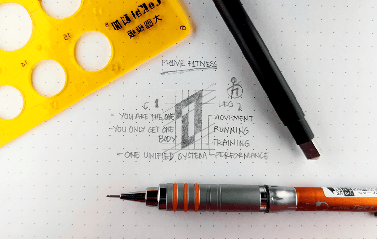
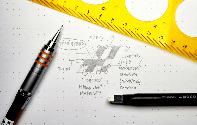
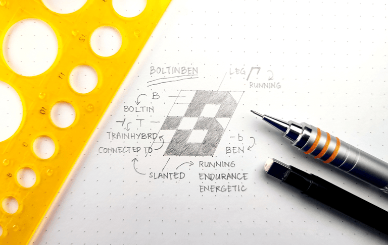
Following the Search Phase, I use my Hand (H) to sketch and vectorize. The Hand Phase allows me to quickly sketch ideas from different shapes. The sketch is based on the search process. From there, I can vectorize my sketch to create a digital version to use in the design process.
Analyzing is the third phase. Reflect on whether the design is effective, aesthetically pleasing, and functional. Evaluate the success of the design and consider ways to improve it. Make adjustments if necessary. Test the design to ensure that it is working as intended.
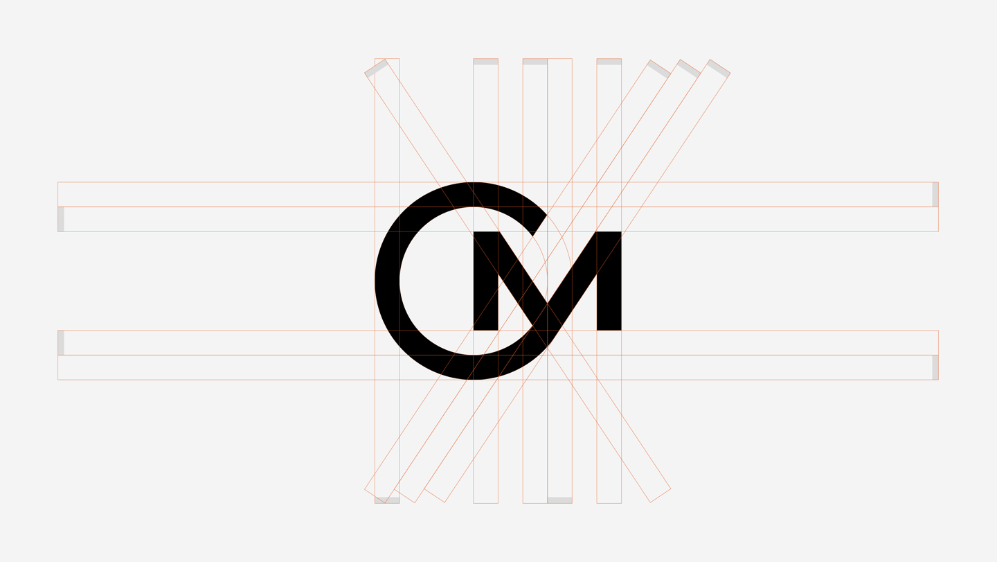
Using Adobe Illustrator, I created the logomark and logotype using a logo grid. The logo grid helped me to position and format the logo elements in a way that was aesthetically pleasing and harmonious. It also allowed me to ensure that the logo elements were consistent in size and spacing, and that the logomark and logotype were in harmony.
Black and white is the best color to start with when designing a logo because it focuses our attention on the shapes. Black and white are the simplest colors to work with, and they have no distractions. They also create a strong contrast between the shapes, which makes it easier to identify them.

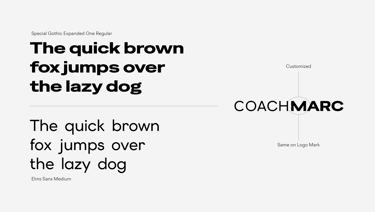
When the mark and type work in harmony, a logo effectively communicates and reinforces the brand’s identity.
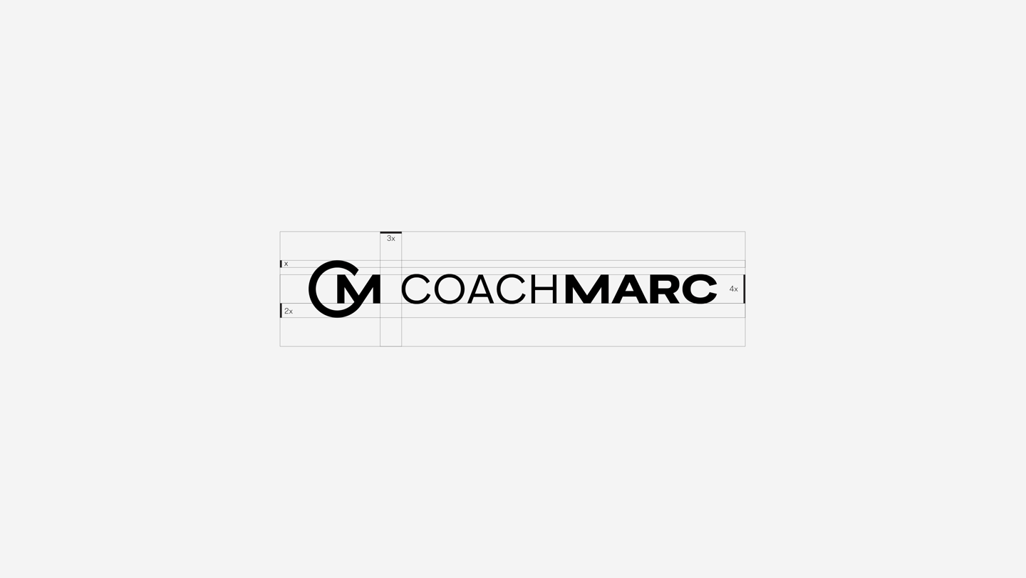

Using an appropriate spacing and balancing logo mark and logo type will result in a visually appealing logo.

Black-and-white horizontal logo version. The logo must remain effective in black and white.
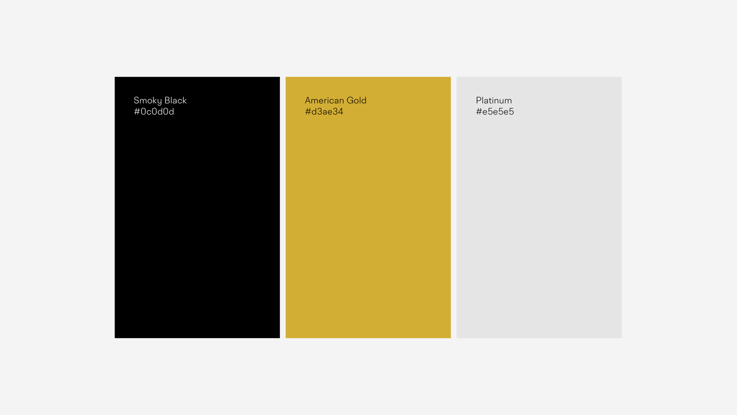
Color is part of a visual identity. It can evoke emotions, set the mood, and create an impression on customers. Color can also be used to differentiate a brand from its competitors. Color is one of the first things customers see, and it can be a powerful marketing tool.
It can be used to create a consistent look and feel for your brand, as well as to make your brand stand out from its competitors.
Here’s the Full-Color Horizontal Version of the logo.

This is the Full-Color Vertical Version, created to work seamlessly in responsive formats.
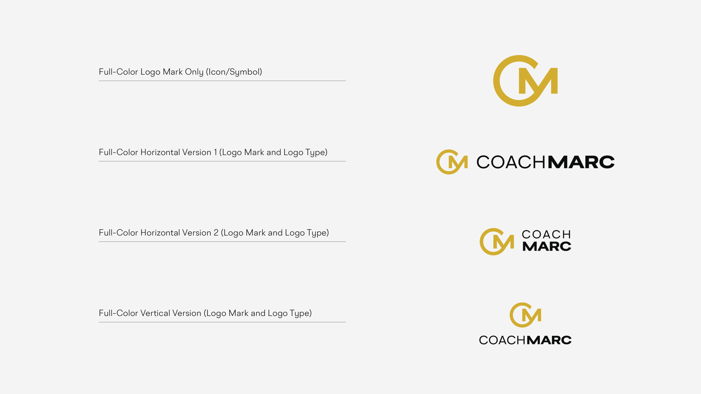
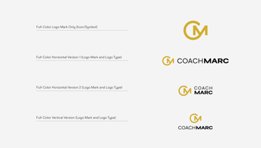
The logo design must be recognizable even at a small scale. It should stand out and be easy to remember. It should also be versatile and able to work across different mediums. The logo should be simple and eye-catching, so it doesn't get lost when scaled down.
It should also be timeless, so that it won't become outdated in a few years. Finally, it should be versatile enough to be used in a variety of contexts and on different media.
Presentation is the fourth phase. This phase is where ideas transform into compelling stories. Refined logo concepts are showcased with clarity, backed by strategic reasoning that explains not just how the design looks, but why it works. Each presentation highlights the thought process behind the visuals — from color choices
and typography to symbolism and adaptability — ensuring the client understands the design’s alignment with their brand identity, values, and audience. The goal is to communicate confidence, provide context, and make the design resonate as both creative and strategic.
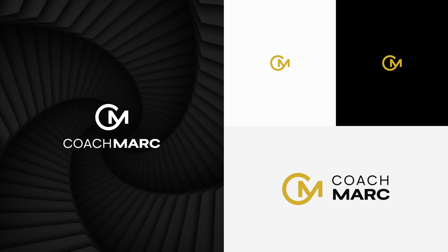

All of the images shown here are part of the presentation, helping illustrate how the logo is created through the S.H.A.P.E. Design Process.
Engage Phase is the fifth or last phase. The logo design needs to be created in collaboration with the client. In order to finalize the design, his feedback is needed.
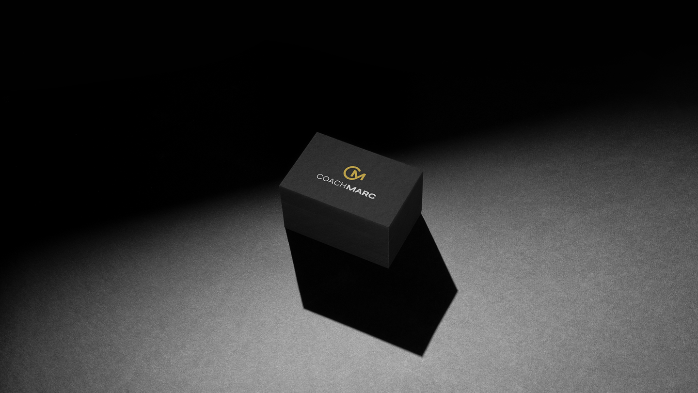
You can visit the logo in action in the link below:
https://thecoachmarc.com/
Ready to elevate your brand with a logo that SHAPE? Let’s collaborate using my S.H.A.P.E design process! Message me today to get started.
Ready to elevate your sports or fitness brand with a logo that SHAPE?
Let’s team up through my S.H.A.P.E. Design Process—crafted to build visual identities that are recognized, remembered and trusted. Message me today and let’s shape a brand that moves people.
Ready to elevate your sports or fitness brand with a logo that SHAPE?
Let’s team up through my S.H.A.P.E. Design Process—crafted to build visual identities that are recognized, remembered and trusted. Message me today and let’s shape a brand that moves people.
Jolan Jimenez
I design logos that SHAPE through my S.H.A.P.E. Design Process, shaping visual identities for sports and fitness brands that are recognized, remembered, and trusted.
TO GOD BE THE GLORY!
design@jolanjimenez.com
Philippines
©2026 Created by Jolan Jimenez. DTI/BIR Registered.

